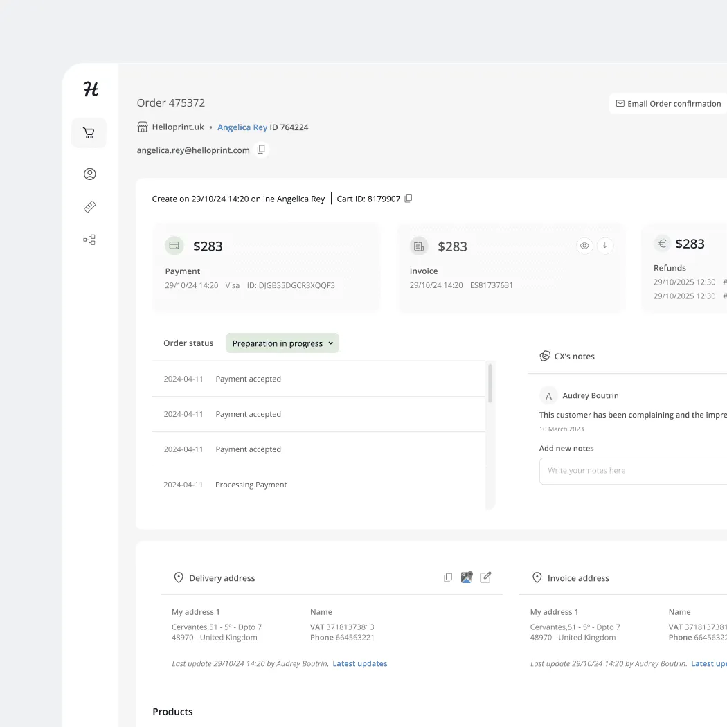
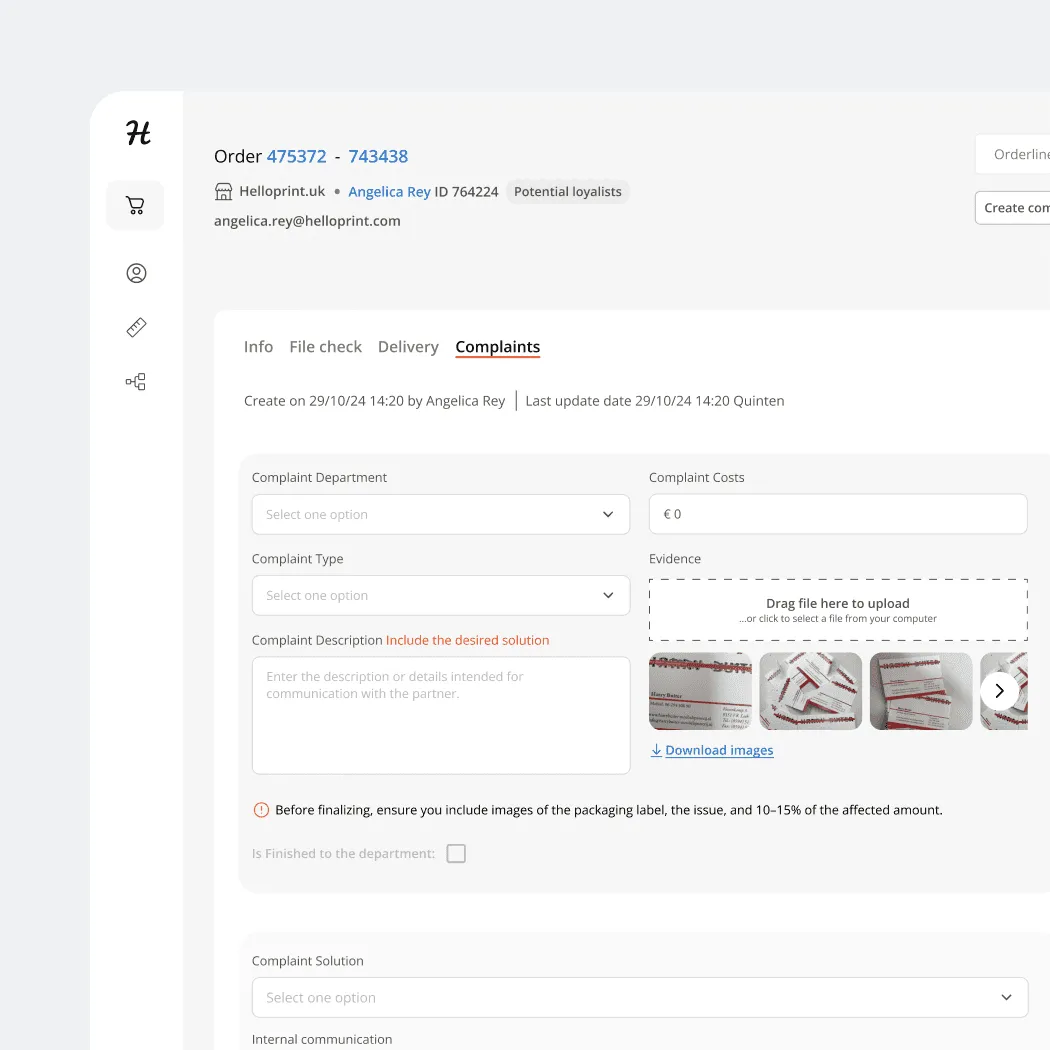
HelloPrint's checkout, post-purchase, and customer account flows had accumulated friction over years of individual patches. Heatmap analysis, CS ticket data, and session recordings revealed clear patterns of friction across the customer journey. I set out to understand where users were struggling and which moments were worth redesigning first.
HelloPrint's checkout, post-purchase and customer account flows had accumulated friction over time. I combined Hotjar heatmaps, session recordings and customer support data to understand where users were struggling and identify the moments with the greatest impact on the experience.
Three patterns stood out: billing address validation during checkout, an overloaded order confirmation experience after purchase, and limited control over artwork in the customer account.
Rather than redesigning the entire experience, I focused on the moments where friction was most visible and most costly.
Checkout analytics showed a significant drop-off at payment, with 23% of users abandoning the flow after encountering billing address validation issues.
The problem wasn't the amount of information required, but when and how it was being validated. The billing address was validated only after submission, creating an avoidable interruption at the most critical point of the journey.
I consolidated the checkout from 5 steps to 3, moved billing address validation inline and introduced support for international address formats.
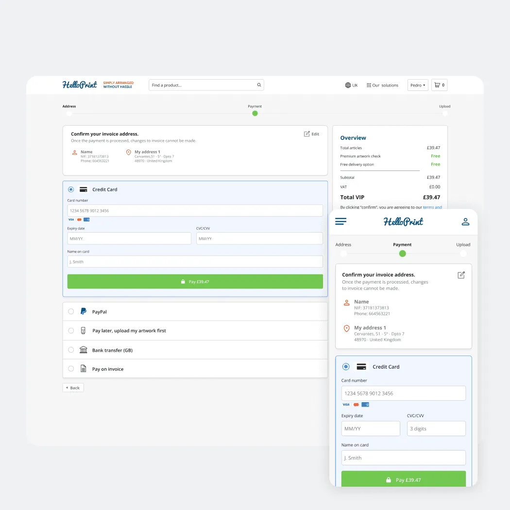
Simplified payment experience.
The order confirmation page had become overloaded with actions and information. After placing an order, customers could be asked to pay, upload artwork or select options, but the page didn't make it clear what they needed to do next or when they needed to do it.
The challenge was not adding more functionality, but creating a clearer post-purchase journey. We redesigned the order page around the information customers needed most: when their order would be delivered, what actions were required, and when each action needed to happen.
Artwork management was also moved into the account area, where customers could manage the artwork for each product directly instead of handling everything from the confirmation page.
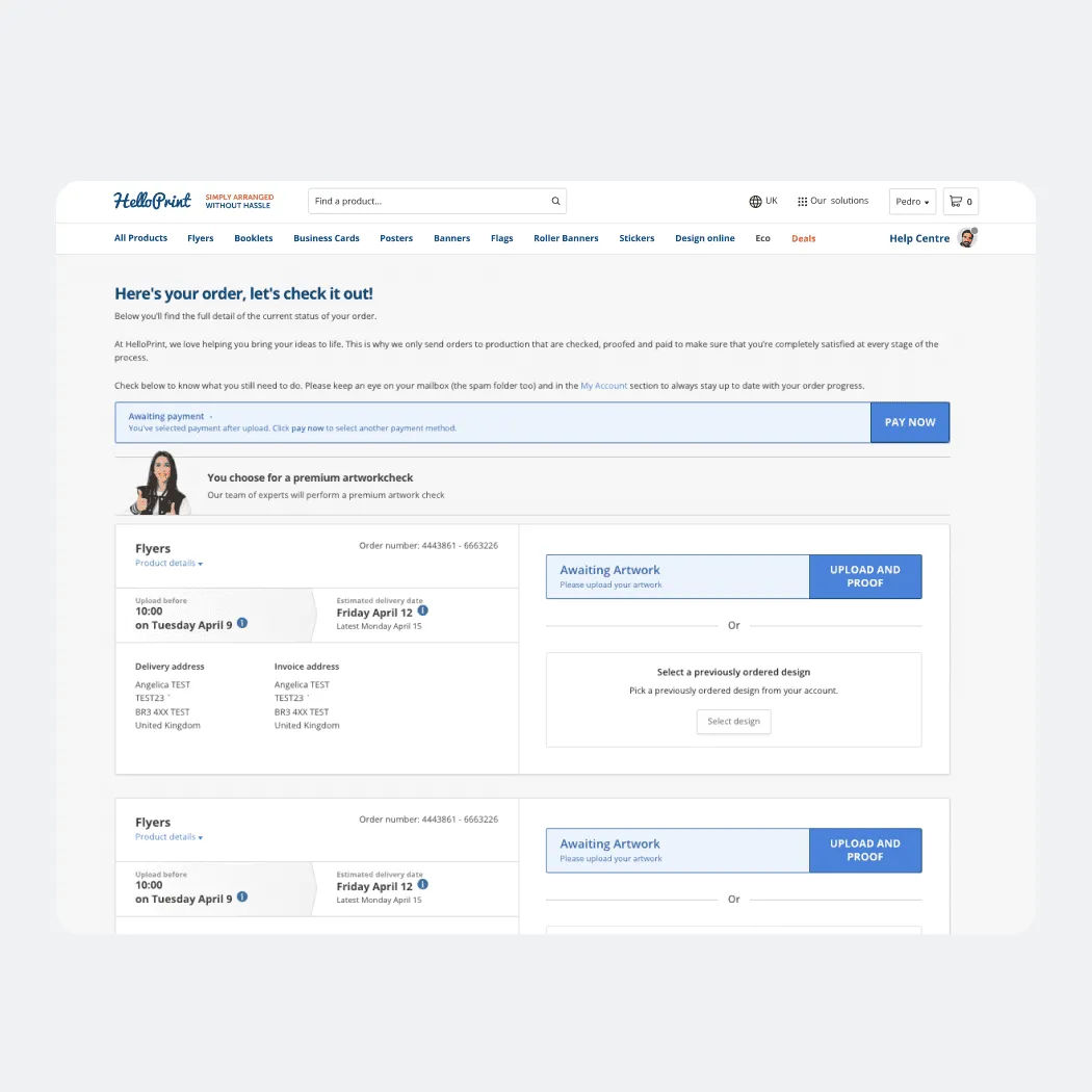
Outdated order confirmation experience.
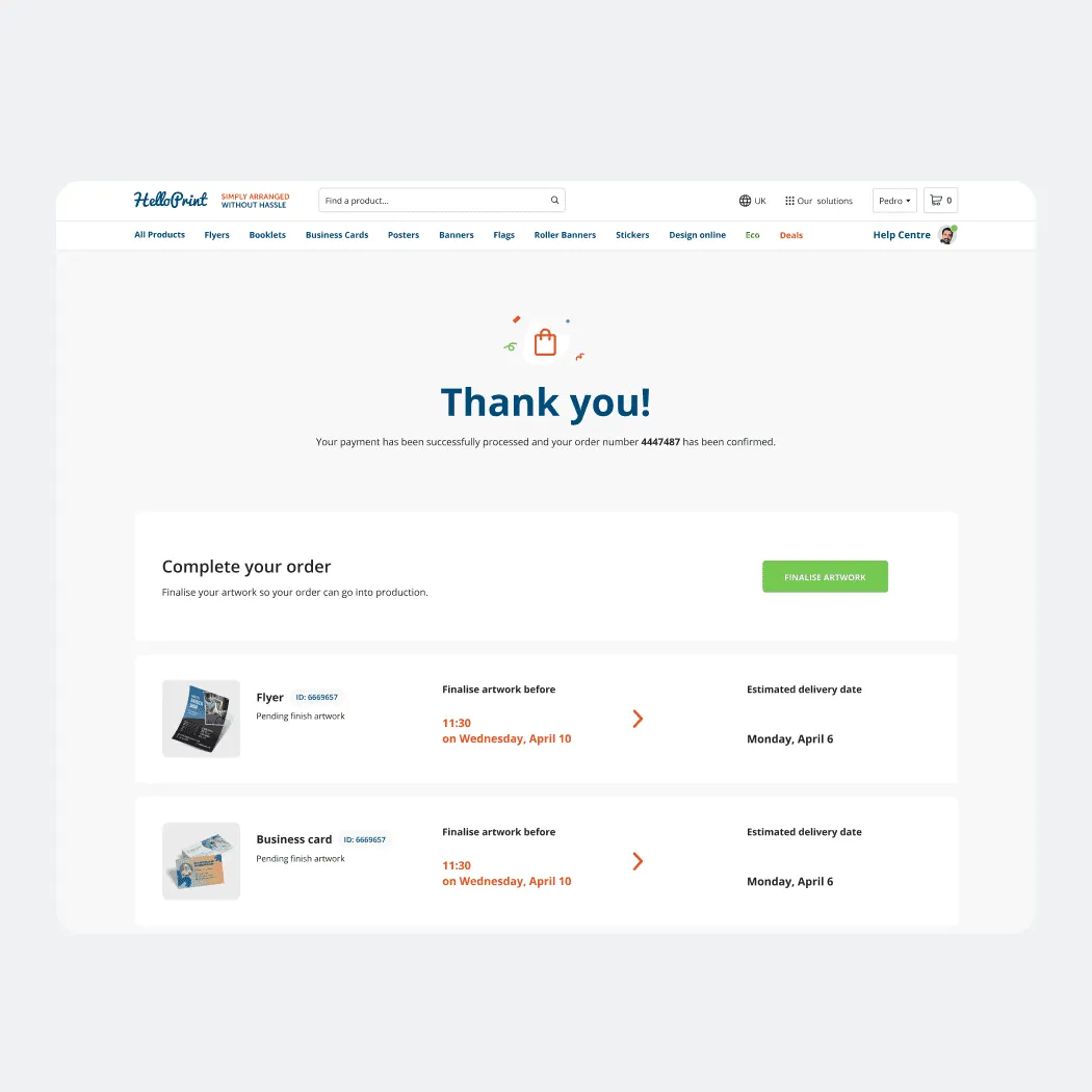
New order confirmation page
The customer account was originally little more than an order history. We saw an opportunity to turn it into the place where customers could manage everything needed after purchase.
Customers could access and manage artwork independently for each product, without having to return to the order confirmation page.
We introduced an automated artwork check that reviewed uploaded files and gave customers immediate feedback. Instead of discovering an issue later in the process, customers could understand whether their artwork was ready, what needed to be changed, and receive recommendations when improvements were needed.
The account evolved from a static archive into an active workspace for managing orders and artwork.
The redesign focused on three high-friction moments across the customer journey: checkout, post-purchase and account management. Each was addressed through a different design response, guided by behavioural and support data.