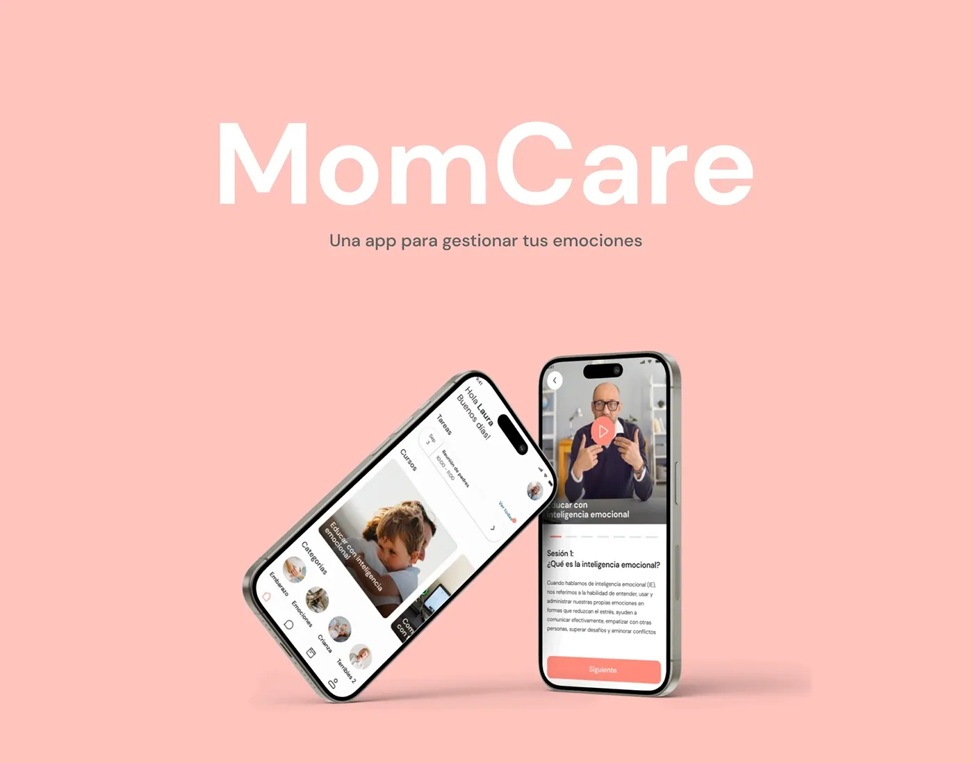
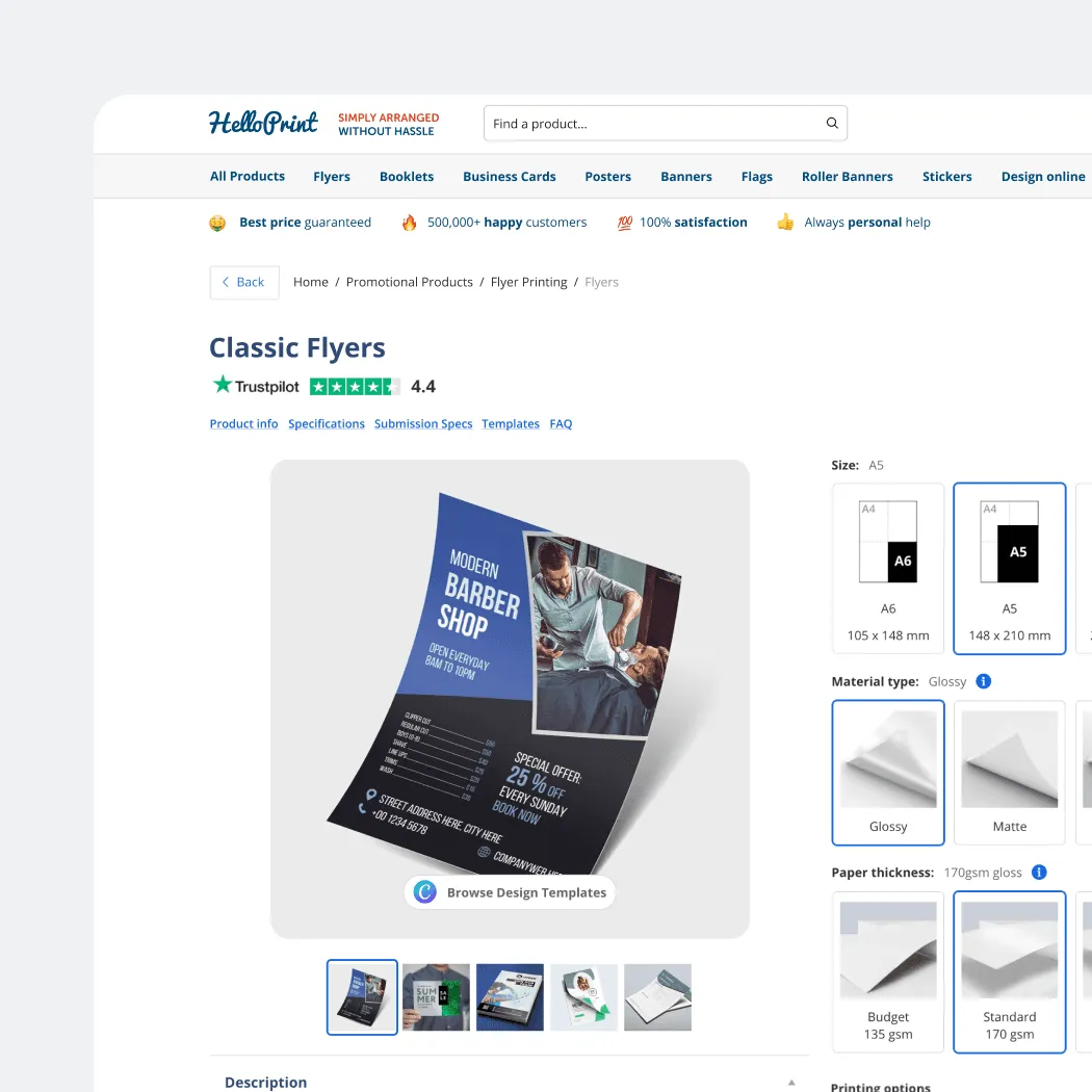
A UX/UI technical challenge completed under real hiring conditions: designing a web application interface and marketing landing page from brief to high-fidelity screens. Technical challenges reveal how you work under pressure. My approach is clarity first, system second, craft third.
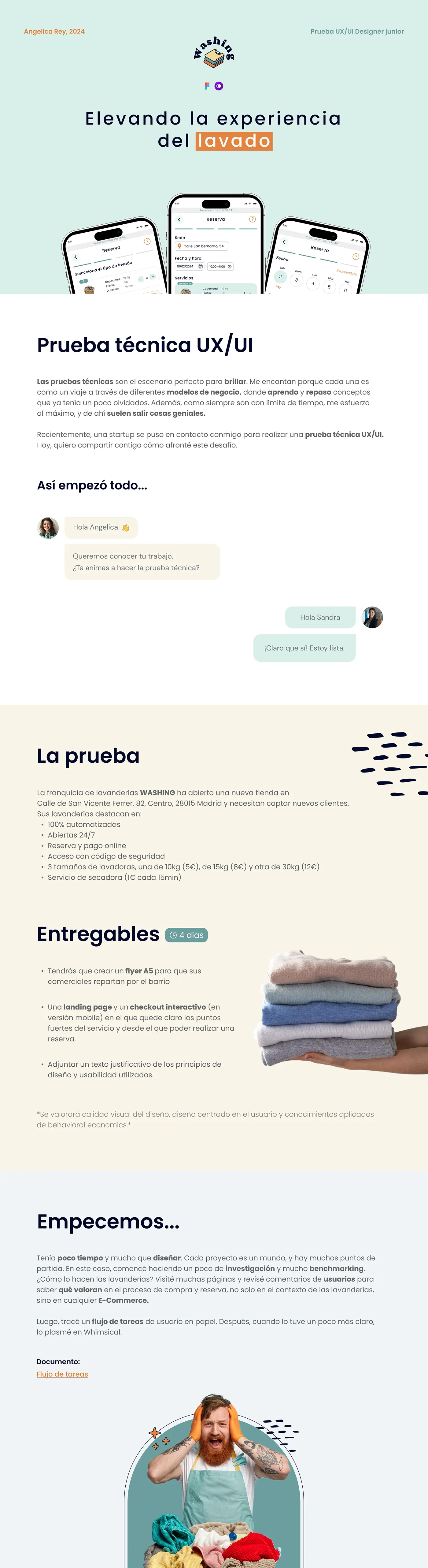
Technical challenges are a useful lens into how a designer actually works: not just what they can produce when given unlimited time, but how they make decisions under pressure. My process doesn't change. Understand what the design needs to communicate, establish the system, then refine the details. The constraint just compresses the timeline.

The landing page was designed to communicate the product's core value in the first viewport: a clear headline, visual proof of the product, and a CTA that didn't require explanation. The layout was designed mobile-first, with visual weight guiding the user from problem to solution to action.
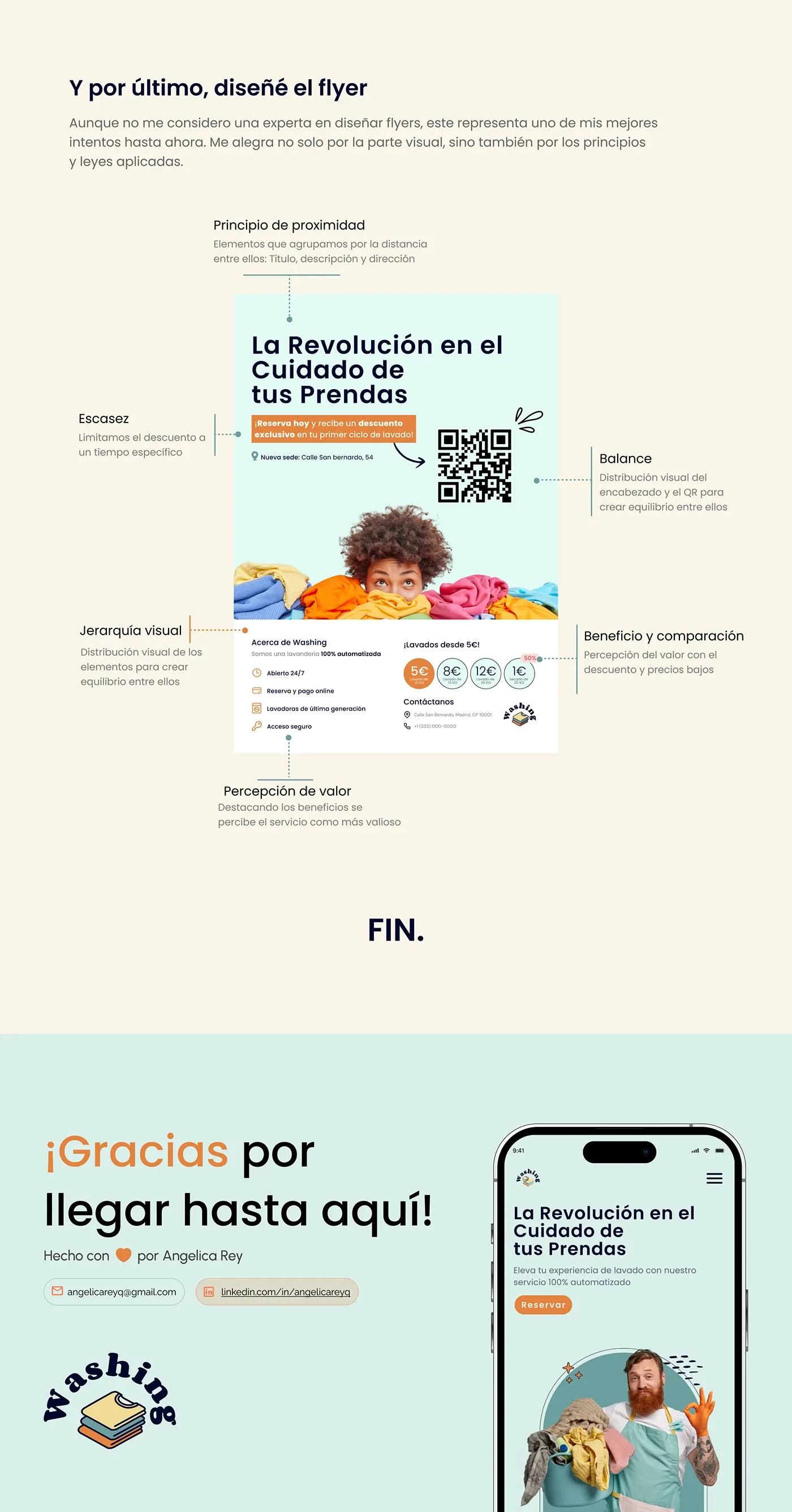
The result was a coherent, production-ready set of screens demonstrating both product thinking and visual design quality within the defined constraints. Clarity of thinking before visual execution: that principle doesn't change regardless of time pressure.